As you’ve all probably noticed by now–we went through a rebrand back in August. If you’re not sure what we’re talking about, you can read all about it right here.
But if you’re already up to speed, then we’d like to take you on a mostly-visual journey of exactly what the branding process looks like (and why it can often take a while to get it just right ).
LOGO
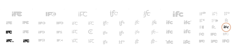
First: we met with our branding expert, the incomparable Sara Fitzgerald. We apprised her of all our well-conceived thoughts about what our brand should be and then the following happened:
- She worked her magic and came up with so many cool options–and a whole sheet of “other options” that she conjured without any input from us.
- We realized, after seeing the proof, that all of our “well-conceived” initial meeting thoughts were a bunch of nonsense. Thank goodness Sara is so good at what she does. (Mind reading, presumably.)
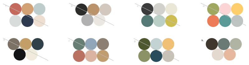
Below you can see ALL of the options she came up with, what we narrowed it down to, and in the salmon-colored circle: what we ultimately chose. (From Sara’s “other options” file.)
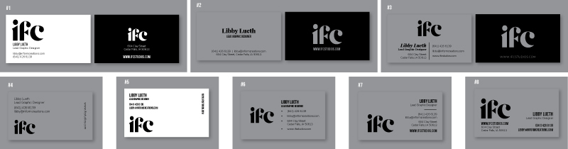
FONTS
Next, the process moved on to our Graphic Design Lead, the marvelous Libby Lueth. Libby used pre-written copy from our website as the template for a variety of different font combinations. (We spent a looooong time deciding what font really said, “Let us introduce ourselves” the best. Because, guys, we’re artists.)
You can see below that all but 3 options were greyed-out and dismissed.
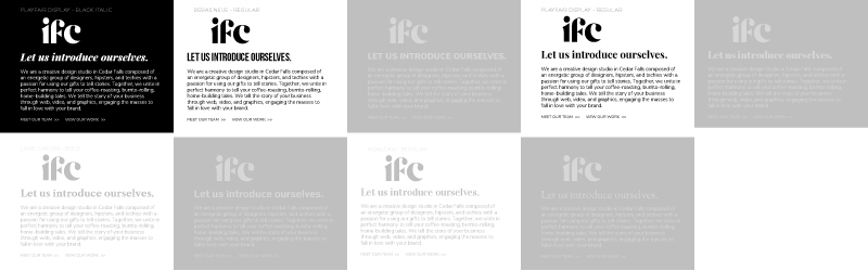
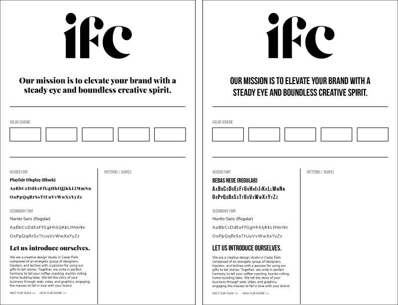
We finally narrowed down to the following two options and Libby created a brand board template.
COLOR PALETTE
Finally, it was time for color. We wanted something that portrayed a modern company with fresh sensibilities who would be serious and approachable with clients, but also a little playful.
Frankly, that’s kind of a lot to ask of 5 colors, but we think we nailed it. (See bottom right)
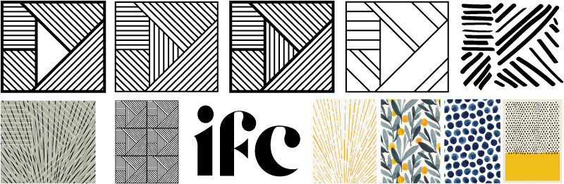
PATTERN
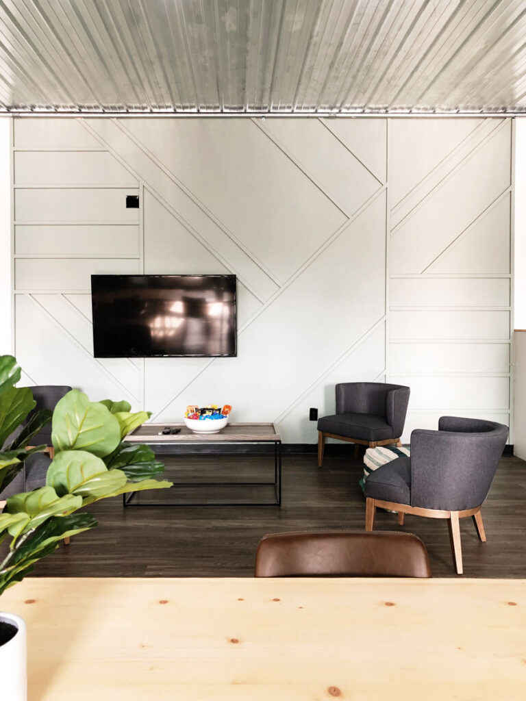
An element that we often add to our client work is either “textures” or “patterns” that can be used on their websites or in print pieces to add additional depth and recognition. We took inspiration from a wall that Tony and Jamie built in the office for ours.
“IFC STUDIOS”
Can you believe how much work goes into the whole branding process? Neither could we. We were exhausted–but we pressed on! After all, our name is not just “IFC” it’s “IFC Studios.” So we had to choose an orientation for that. We ultimately settled on the far right versions.
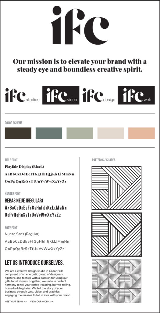
BRAND BOARD
FINALLY–we had it figured out. All finished. Sound the trumpets! Strike up the band! Other celebratory turns-of-phrase! Below you can see our finished brand board.
ODDS AND ENDS
Okay, so we weren’t totally done. We still had business cards to make, social media templates to create, ads to generate, stickers to print…and more. But at the end of the day–we’ve created a thorough and recognizable brand that, at least to us, says without words:
Our mission is to elevate your brand with a steady eye and boundless creative spirit.
If you need any help with your branding or re-branding journey–we’d love to chat about it with you.
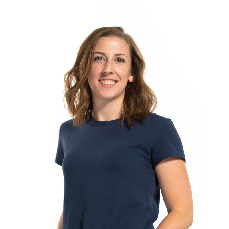
ABOUT LIBBY
Libby is our Lead Graphic Designer and also has the task of managing a family consisting of her high school sweetheart, 2 dogs, a toddler, and tiny, adorable newborn. If you see someone wandering aimlessly through Target with a smile on her face–it might just be Libby.

