Introduction
PANTONE®. Whether or not you know much about print and digital color management, you’ve probably heard that word. It’s a word synonymous with color, much like “Adobe” is synonymous with desktop publishing, or “Kleenex” with tissue.
So what is it, exactly? The Pantone Matching System as it is called, or PMS for short, is a color standardization system used around the world for maintaining the accuracy of colors in all types of printed materials. It is designed to work with any type of equipment used in producing color.
Sounds great, right? It is, in some ways. For designers everywhere, it’s been the industry standard for color consistency. And just like designers everywhere, all of us at IFC have long practiced using PANTONE color swatches for branding and identity.
That is, until August 2022.
PANTONE’s Blue Banner of “Death”

Beginning in late summer of 2022, this alert began to pop up on our Adobe suite software (Photoshop, Illustrator, and InDesign, to name a few): “Some Pantone colors may no longer be available due to changes in Pantone’s licensing with Adobe.” You can imagine our reaction, but it could probably be summed up with three little letters: WTF?!
The “licensing changes” can be boiled down to this: Pantone decided to end its partnership with Adobe, and no longer allowed Adobe software to have access to these built-in color libraries. If you wanted to keep using them, you’d have to pay Pantone for them every month.
Not only that, it meant that our CLIENTS would have to pay for this fee if we used any PANTONE colors in their designs; otherwise, they would be unable to make future changes to designs if needed. And if you know IFC Studios at all by now, you know that we’re HUGE fans of giving power to the people (our clients). This was no good at all.
Our studio aside, you can imagine the stir this caused in the community. For many designers, this meant going back to a CMYK color model for printing and trying to convert colors to the closest possible match. For others, it meant paying an additional, monthly fee to continue to use the Pantone color libraries.
One person, however, rejected both options and came up with his own idea. Meet Stuart Semple.
The Robin Hood of the Art World
Stuart Semple is the founder of Culture Hustle, an independent, UK-based manufacturer of premium art supplies. They specialize in developing highly-pigmented acrylic paints, but have their hands in a large assortment of premium art materials (without the premium price tag). He is an avid believer in making good products accessible to artists everywhere.
Global News interviewed Stuart Semple last year. You can find the article (and video interview) here: https://globalnews.ca/news/9581118/colour-crusader-how-the-robin-hood-of-the-art-world-is-liberating-colour-for-everyone/ (Jump to 2:16 to hear from Stuart as he responds to PANTONE’s decision.)
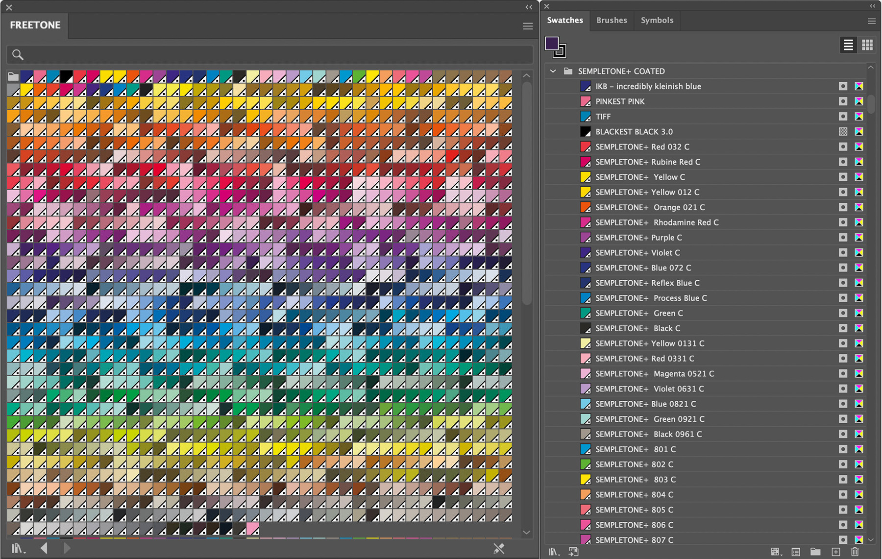
When Stuart began seeing the pop-up alert on his Adobe software, he took matters into his own hands and developed FREETONE: a PANTONE-like color library that features 1280 “liberated colors” from PANTONE’s libraries—for free. (Really! You can get your copy here: https://www.culturehustleusa.com/products/freetone.)
The Color Verdict
After over a year of using Semple’s FREETONE color library, we’re happy to report that we’re just as pleased with its efficacy as we were from Day 1.
The likeness of the color palette is nearly indistinguishable from PANTONE’s libraries. Not only are they nearly identical, but they’re also named with the same number system as PANTONE’s. For example, if you used to use PANTONE 802C, a grassy green color, you’ll be pleased to find a nearly perfect match under “SEMPLETONE 802C” (see what Semple did there? ????).
Aside from the color library’s obvious benefit—using damn-near-perfect copies of PANTONE colors we have all grown accustomed to—Semple’s FREETONE library allows us to continue providing PANTONE swatches if our clients ever require them. And if we ever need to hand off design files? Clients are happily pleased to be able to access the same colors we intended within their designs.
Conclusion
So there you have it, in a medium-sized nutshell: why we ditched PANTONE, and what we’re using instead. At IFC Studios, we believe that if you’re paying us to design, develop, and deliver high-quality materials for your business, you should get to truly OWN them, well beyond the life of the client relationship. Just like we hand over the keys when we complete a website project, the same is true for any graphic design project as well.
Is YOUR web or design agency holding all the cards? Are you at their mercy anytime you need something changed with your website or print materials and are looking for a way out? Reach out to us here at IFC Studios. We’d love to chat with you and see how we can help.

