A Waterloo public benefit corporation that cultivates community wellness
When We Arose approached us in 2021, they needed a lot of help. They knew that their website wasn’t intuitive, that they had no central message, an outdated information gathering system, and a hit-or-miss social media presence. They had so much to offer the community–from activities to volunteer opportunities, to access to fresh fruits and vegetables, and more–but their website wasn’t helping them reach their audiences.
One of the reasons that We Arose was having trouble developing a central message for its organization was because it was basically three organizations in one. The first was a lifeline to area farmers. Through We Arose’s other activities there were opportunities for those participating in the Co-Op to sell more food, get marketing help, gain leadership skills, and more. The second was to help provide fresh fruits and vegetables within the 4th Ward of Waterloo (which is considered a “food desert.”) The third was to become a part of the community at large. We Arose offers these opportunities in spades–from volunteering at community gardens to going on group bike rides to attending social events to drink and mingle. These three missions seemed somewhat divergent–but in truth they weren’t. They all held the City of Waterloo and its citizens at the heart. So when we came up with the tagline: cultivate community wellness, it had multiple meanings. Not only is cultivating community wellness at the heart of We Arose’s mission, those three words also represent the three parts of the organization. “Cultivate” represents the farmers. “Community” represents volunteer opportunities and community events. “Wellness” represents the efforts to provide the 4th Ward with access to fresh fruits and vegetables.
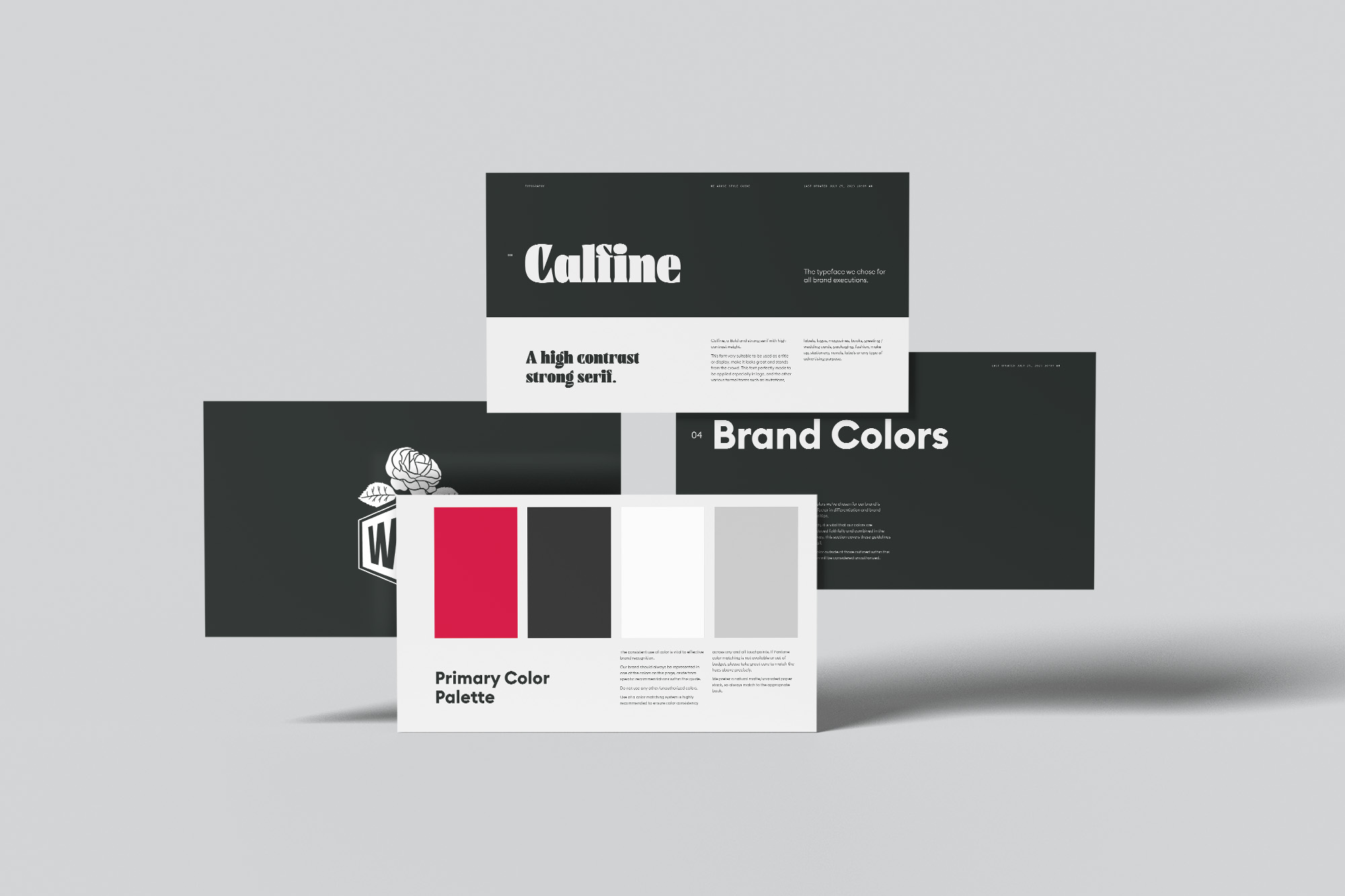
Branding
We Arose loved their logo, but still wanted to elevate their look. We worked with them to formalize their color palette and choose more impactful typography that aligned with their message.
Website
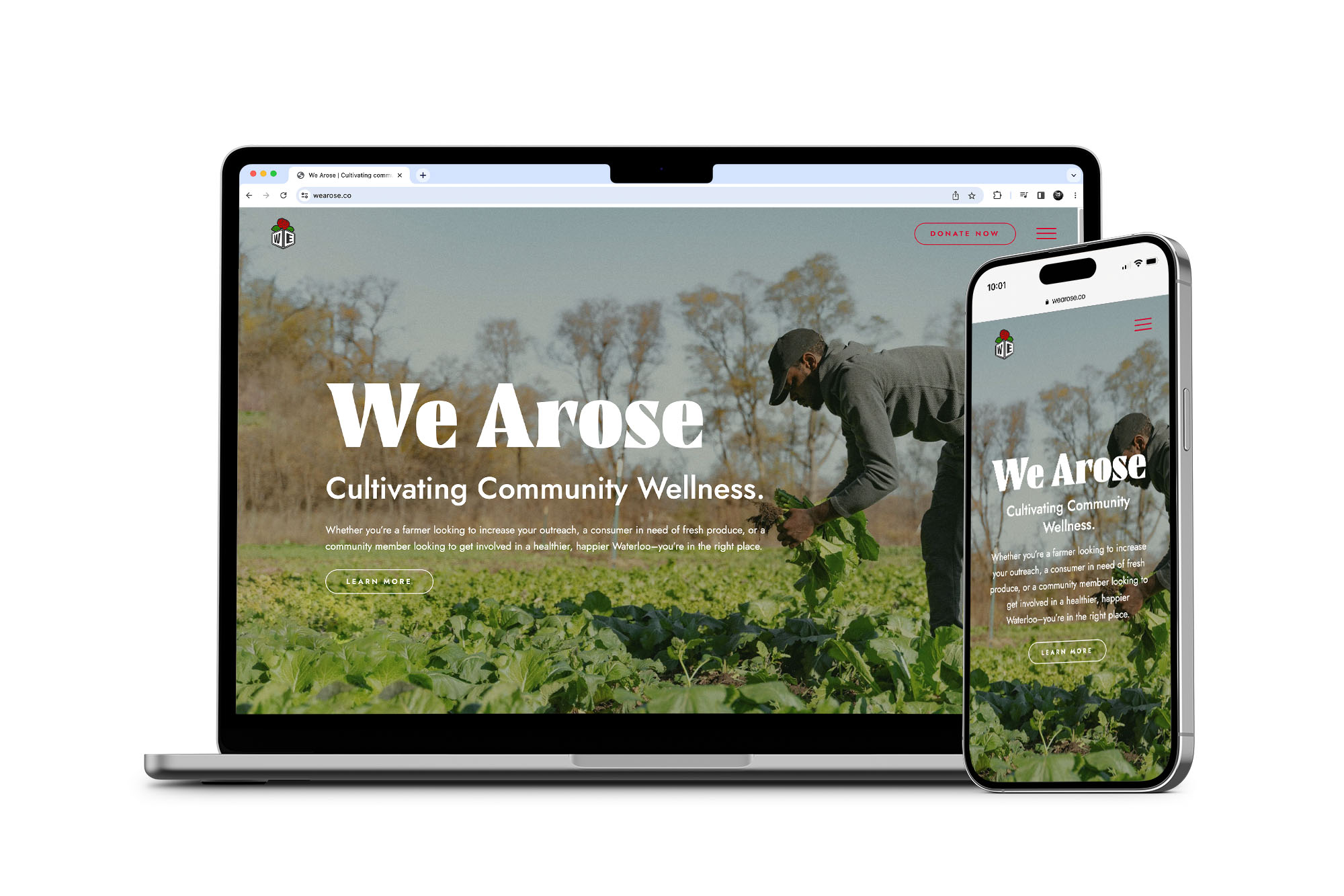
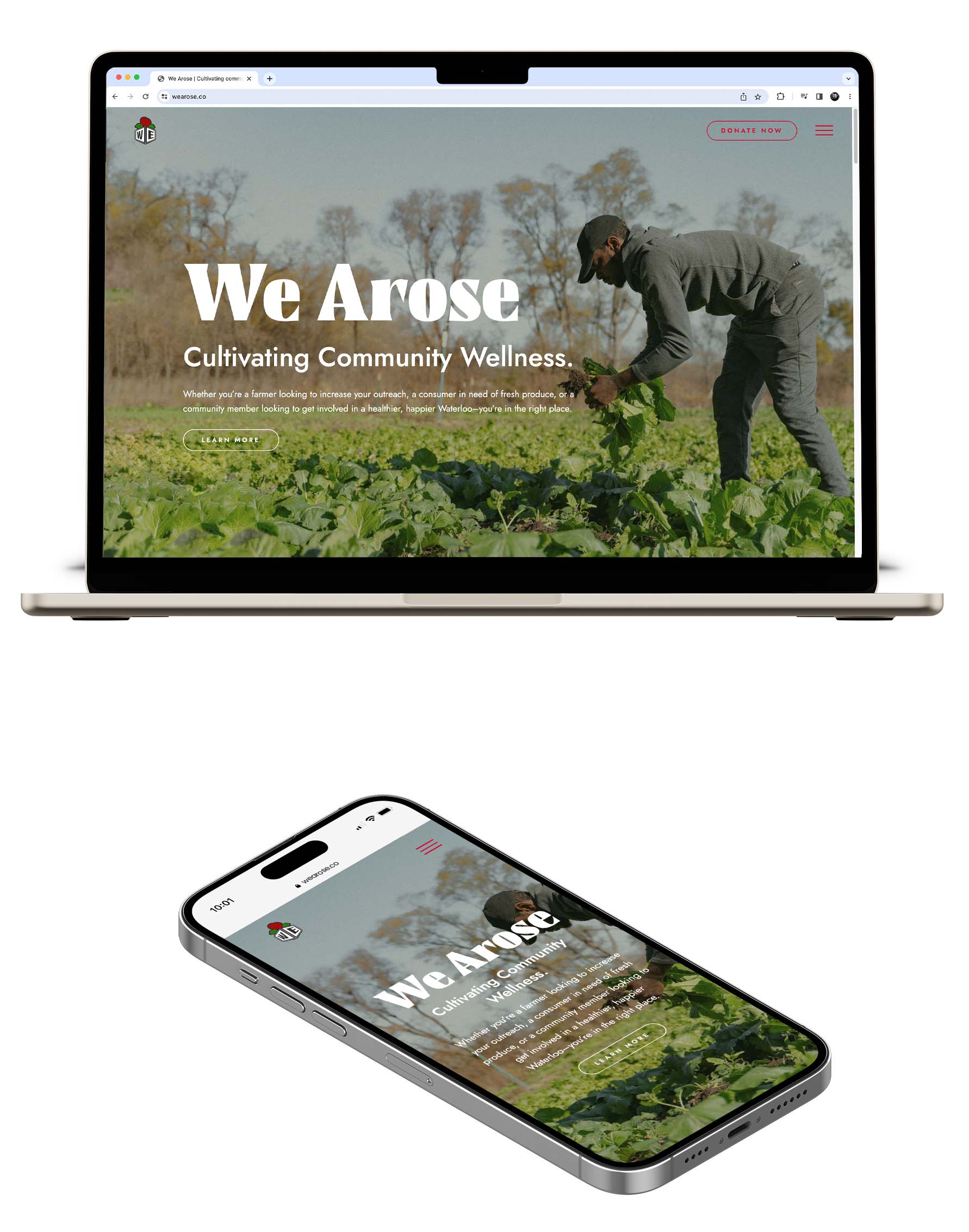
The most striking thing about the old We Arose website was a short video that lived on the homepage, but striking doesn’t necessarily mean functional. Because their original set up didn’t allow for a lot of customization, there was a lot of physical paperwork on the backend that needed management. And for an organization with rotating volunteers and employees from a variety of organizations–that made things tough. Not only did we up the design impact, but we also made the website easier to navigate for users, and a headache-saver for DaQuan and his team by building in a donation platform and a contact form with conditional logic that gets the right forms signed for the right people every time.
The photos for this project were time sensitive. The day needed to be clear enough, and the gardens full enough, to showcase the full extent of the good We Arose is doing. In the end the lush, green of the vegetables and DaQuan at work contrast beautifully with the reds, blacks, and whites of the branding.
Like what you saw?
Keep browsing our favorite projects or contact us today to get started on one of your own.