Welcome back to our four-part series on democratizing design. In our first blog, we went over several ways that we democratize messaging for our clients. Last week we went over democratizing websites. This week, we're sharing three ways that we're democratizing branding. Let's get started.
Raise your hand if you’ve ever seen a company use 10 slightly different shades of blue across all of their branding 🙋♂️. Not very professional, right?
At IFC Studios, every brand project gets a brand guide from us at the end—whether it's for a completely new brand identity, a full-scale brand redesign, or a simple brand refresh. So what is a brand guide, exactly? Simply put, a brand guide is a set of rules, parameters, and guidelines for displaying your brand.
A successful brand guide should include, at minimum:
The benefit of a brand guide to the client is huge, and I’m sure you can imagine why. With a brand guide, there is always a point of reference to rely on. Employees may come and go, and roles within the company can change with the needs of the business. By keeping a brand guide handy, everyone can understand how the brand should be shared with the world. The same is true anytime the client needs to hire a 3rd party. From social media managers, to print shops, to exterior signage: our clients can share their brand guide with these 3rd parties to ensure their brand stays consistent.
Have you ever run into a situation where you couldn’t use a font because you didn’t own it? Super frustrating! And that frustration is exponentially increased if it’s a font that was used in your branding. (Trust us, we’ve seen it happen.)
When we develop your branding, we only use fonts that are:
When we finish your branding project, we’ll ensure you have access to the font files, so you can download and install them to your computers, use them on your website, and so on.
The same is true for color. Wait a minute—color?! Are there really colors locked behind a paywall? Yes! In a recent blog post, we discussed in detail the recent changes to Pantone’s licensing system. (You can read that post here if you want.) The short of it is, Pantone now requires a monthly subscription to access their precious palettes.
As of 2023, we opted to develop color palettes that are Pantone-free. Using a clean color values system, we can deliver you CMYK and RGB colors that you can use anywhere, and they will be as consistent as possible. No paywall required.
Finally, most of our branding projects include templates for reproducing branded designs. This can be anything from business cards, to social media posts, and much more. We typically like to use a tool called Canva to share these templates with our clients. With it, we can share working, editable templates with our clients, without them needing a costly subscription to Adobe software to use them.
As you can see, our clients benefit greatly from our democratization of branding. It allows them to 1) follow the guidelines in their brand guide; 2) freely use their logos, fonts, and colors on their own computers; and 3) continue to build and expand their brand collateral at their discretion. Gone are the days of needing to reach out to their designer every time they need a file, or can’t remember what colors or fonts to use, or worse, needing to pay an exorbitant fee just to make small changes to the designs they have already paid for. Power to the people.
P.S. Don’t want to take the reins on your branding? We’ll always be here to help you out. Contact us today.
Photo by Patrik Michalicka on Unsplash
PANTONE®. Whether or not you know much about print and digital color management, you've probably heard that word. It's a word synonymous with color, much like "Adobe" is synonymous with desktop publishing, or "Kleenex" with tissue.
So what is it, exactly? The Pantone Matching System as it is called, or PMS for short, is a color standardization system used around the world for maintaining the accuracy of colors in all types of printed materials. It is designed to work with any type of equipment used in producing color.
Sounds great, right? It is, in some ways. For designers everywhere, it's been the industry standard for color consistency. And just like designers everywhere, all of us at IFC have long practiced using PANTONE color swatches for branding and identity.
That is, until August 2022.

Beginning in late summer of 2022, this alert began to pop up on our Adobe suite software (Photoshop, Illustrator, and InDesign, to name a few): "Some Pantone colors may no longer be available due to changes in Pantone's licensing with Adobe." You can imagine our reaction, but it could probably be summed up with three little letters: WTF?!
The "licensing changes" can be boiled down to this: Pantone decided to end its partnership with Adobe, and no longer allowed Adobe software to have access to these built-in color libraries. If you wanted to keep using them, you'd have to pay Pantone for them every month.
Not only that, it meant that our CLIENTS would have to pay for this fee if we used any PANTONE colors in their designs; otherwise, they would be unable to make future changes to designs if needed. And if you know IFC Studios at all by now, you know that we're HUGE fans of giving power to the people (our clients). This was no good at all.
Our studio aside, you can imagine the stir this caused in the community. For many designers, this meant going back to a CMYK color model for printing and trying to convert colors to the closest possible match. For others, it meant paying an additional, monthly fee to continue to use the Pantone color libraries.
One person, however, rejected both options and came up with his own idea. Meet Stuart Semple.
Stuart Semple is the founder of Culture Hustle, an independent, UK-based manufacturer of premium art supplies. They specialize in developing highly-pigmented acrylic paints, but have their hands in a large assortment of premium art materials (without the premium price tag). He is an avid believer in making good products accessible to artists everywhere.
Global News interviewed Stuart Semple last year. You can find the article (and video interview) here: https://globalnews.ca/news/9581118/colour-crusader-how-the-robin-hood-of-the-art-world-is-liberating-colour-for-everyone/ (Jump to 2:16 to hear from Stuart as he responds to PANTONE's decision.)
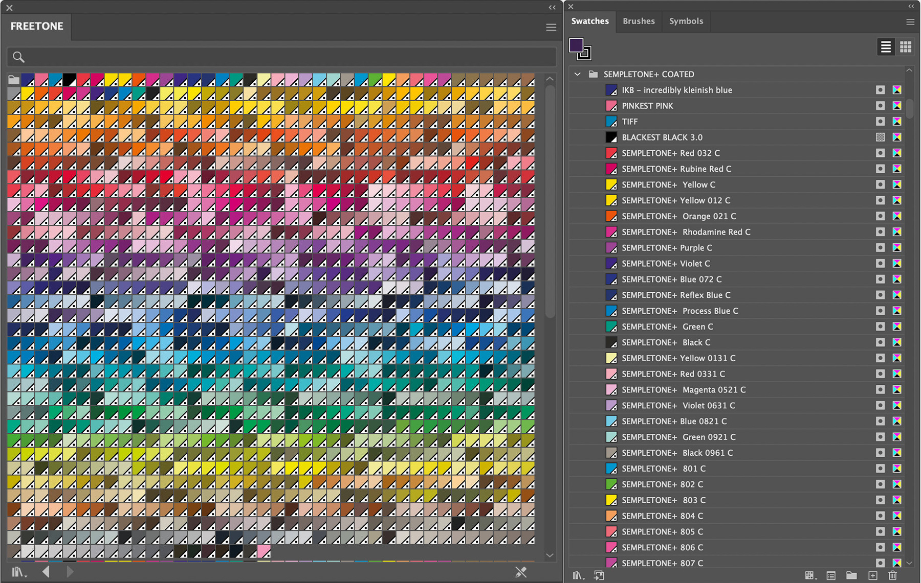
When Stuart began seeing the pop-up alert on his Adobe software, he took matters into his own hands and developed FREETONE: a PANTONE-like color library that features 1280 "liberated colors" from PANTONE's libraries—for free. (Really! You can get your copy here: https://www.culturehustleusa.com/products/freetone.)
After over a year of using Semple's FREETONE color library, we're happy to report that we're just as pleased with its efficacy as we were from Day 1.
The likeness of the color palette is nearly indistinguishable from PANTONE's libraries. Not only are they nearly identical, but they're also named with the same number system as PANTONE's. For example, if you used to use PANTONE 802C, a grassy green color, you'll be pleased to find a nearly perfect match under "SEMPLETONE 802C" (see what Semple did there? 😉).
Aside from the color library's obvious benefit—using damn-near-perfect copies of PANTONE colors we have all grown accustomed to—Semple's FREETONE library allows us to continue providing PANTONE swatches if our clients ever require them. And if we ever need to hand off design files? Clients are happily pleased to be able to access the same colors we intended within their designs.
So there you have it, in a medium-sized nutshell: why we ditched PANTONE, and what we're using instead. At IFC Studios, we believe that if you're paying us to design, develop, and deliver high-quality materials for your business, you should get to truly OWN them, well beyond the life of the client relationship. Just like we hand over the keys when we complete a website project, the same is true for any graphic design project as well.
Is YOUR web or design agency holding all the cards? Are you at their mercy anytime you need something changed with your website or print materials and are looking for a way out? Reach out to us here at IFC Studios. We'd love to chat with you and see how we can help.
In a perfect world, the birds are singing, the sun is shining, and the budget for your next big business venture is unlimited. The reality though? We all have limits imposed on us. And that is especially true when it comes to starting a business. The budget is rarely what we want it to be. Certain things inevitably get trimmed down or cut entirely. And all too often, the thing we see getting cut is one of the most important things to the success of the business: the brand.
We’ve all heard the expression, “Don’t throw the baby out with the bathwater,” right? Do you know where it comes from? Records date it back to Germany in the 16th century. Clean water was not as readily available as it is now, so people would bathe infrequently. And when they did, the whole family would use the same tub of water to wash up (omg, imagine).
Here’s how it went. You would usually start with the oldest member (mom or dad) and work your way through the family line-up until—you guessed it—the baby gets a turn. By the time they got to the baby, that water was dirty, cloudy, and disgusting. The phrase was a reminder: don't throw out something good while throwing out something bad. (I love plumbing, don’t you?)
Okay, analogy breakdown time. The bathwater? That’s the budget for your company. And the baby? That’s your brand. Before you spend all your budget, make sure you have everything accounted for (in this case, your brand).
As a seasoned creative agency, we’ve met our share of clients who have tossed the proverbial baby (their brand) out with the bathwater (their budget).
The story is familiar. They spend the lion’s share of their budget on other business expenses, like hiring staff, buying equipment, renting commercial space, construction, etc. All important things, to be sure! But by the time they got to the public-facing elements (their brand), they’d be left with just the dregs of a budget.
The common result? A logo or brand that is either unfinished, lacks polish or depth, or forgotten about entirely. Not a good look—especially if you’re a new company looking to make a good first impression.
The ironic thing is that in the grand scheme of things, a professional brand for your business is rarely the budget burner! The problem usually lies with planning. For many SBOs, the brand is far down the list of priorities. And that’s not a bad thing; investing the most time and money into the business’s core product or service is completely understandable. You want to put your best foot forward when it comes to delivering your offering to your customers.
But that’s assuming you have customers. (Ouch, get some ice for that burn.) Seriously, though. If you want your business to succeed, getting noticed by people is essential to turning them into customers. And if you can’t properly communicate with those people (which is done through your brand before anything else!), then your efforts may not yield the fruit you’re expecting.
The tl;dr of it is this. If you want to invest your business dollars wisely, don’t forget to include branding in the budget. In fact, the sooner you include it in the budget, the farther those dollars will go.
Anyone can design a logo or build a website these days. But branding your business is its own animal, and you don’t have to do it alone. Find yourself an agency that is willing to come alongside you and understand what you are trying to do with your business. Cutting ribbon in a year or two? Find someone to work with now. Don’t wait until you have $500 left just two weeks before opening (we won’t name names).
Last week, you heard from my colleague and our Messaging Director, Amy Mertz. She shared many of the ways you can use messaging to make your brand more impactful with your audience, and how crucial it is to reach the clients you’re after. (Thanks, Amy!)
This week, I’m grabbing the torch—yoink!—to discuss the visual (read: fun) side of all things branding. Let’s get into it.
Now that you’ve learned all about how using the right words can help you reach the right audience, it’s time to help deliver that message through proper visuals. Before you can “preach your gospel,” you need to pull them in and get their attention. We’ll start with the most obvious: the logo. Your logo helps pique the interest of your audience. It’s the symbol of your company; your mission; your raison d’etre. And like the homepage of your website, the logo is often the first thing they’re going to see, so it had better be good. No pressure, right?
Before you try and design something (or hire someone cool to do it for you), there are some things to first consider. What emotions do you want your audience to feel when they discover your company? How do you want them to react? Excited? Curious? Relieved? What impression should they have of you after seeing your logo for the first time? Does it match your expectations?
Developing the right logo is like trying to master a dance. Balance is key. You want it to reflect what you’re selling, but you don’t want it to look like every other logo of your competitors. You want to stand out, not stick out.
Do this: go online and search for competitors in your area. See what their branding looks like. Knowing your competitors is just as important as knowing your audience.
Just like with your logo, fonts can speak volumes. So it’s super important that the look and feel of your message are in sync with the content itself. (Would you hire a lawyer who wrote all his emails in bright green comic sans?)
Want to know one of the best ways to find a font that aligns with your message? Preview it! Take a chunk of your messaging—your tagline, your elevator pitch, etc—and copy it into a font preview tool online. There are a TON of options out there, but I recommend you start with Google Fonts. It’s fast and easy (and free!). From there, you can quickly get a sense for how your message feels when it’s typed out in a particular font. There’s no one right answer, either. Some companies are best suited for a no-nonsense font that is easy to read and gets the job done quickly. Others may find better results in flowy cursive, funky block lettering, or heck: dingbats (I’m sure SOMEONE has done it).
It may seem like the easiest of all three components, but I guarantee that it’s harder than it looks. The theory/psychology behind color, and how it can influence our brains, our emotions, and—let’s be honest—our buying decisions, is wide and vast. Google “color theory” and you’ll quickly get an idea of what I mean. Some things are pretty obvious. For example, financial institutions often steer clear of “hot” colors like red or orange. It can evoke a feeling of volatility that you probably don’t want when you’re deciding who to trust with your money! But other considerations may not be so clear. (Did you know that mosquitos are drawn to dark colors, especially blue?)
The point is, color is highly influential to our brains, and in turn, can greatly affect (for better or worse) our decisions.
Visuals are key to setting the tone of your content. Your logo, the fonts you write with, and even the colors you use, all play a vital role in delivering your message. If you want to make an impact with your message, it’s time to step up your visuals game.
Want some guidance on how to make your messaging and branding more aligned? Contact us today.
If you’re a small business owner, you know how daunting it can be to even consider rebranding your organization. There are so many things to think about, like: How much will it cost? When will I see an ROI? Do I really need to rebrand? Will I lose any business in the process? What if my clients don’t like the changes? What do I need to—
STOP! Remember to breathe. You’re okay.
Before we begin, just know that you’re not alone! Every single business owner or manager has to ask themselves these questions at some point or another in the lifespan of their business. No matter WHAT industry your business is in, taking some time to ask yourself these questions is a great first step. And for your convenience, we’ve broken them down into three, chronological sections: Do Research, Take Action, and Keep Going. Let’s get started!
Evaluate Your Current Brand. Take an honest look at your current brand and what it stands for. Identify what’s working and what needs to be changed. Still unsure? Ask your audience! Send a friendly email asking for their feedback or overall thoughts. You might be surprised by what you learn.
Clarify Your Core Values. Rebranding requires clarity about what your business stands for. Revisit your mission and values, and identify any areas for improvement. Does the look and feel still resonate with the message you’re trying to convey? Or is there a visual mismatch?
Identify Your Target Audience. A huge portion of a company’s success comes down to connecting with the right people. If those connections are starting to feel tired, or like your efforts are missing their mark, it might be time to consider a calibration. Take time to understand your target audience, their values, and their needs.
Review Your Logo. Your logo is the face of your brand, so it’s essential that it’s aligned with your brand and overall company goals. It can be a wonderful way to provide a clear, visual cue to your customers that something is new, and they would do well to pay attention. Now, change can have mixed results. Some relish change and newness—others prefer predictability. If you DO decide that a logo update is in order, know this: you will not be able to please everyone.
That’s why all of those previous points about reviewing your brand, and double-checking your alignment with your goals are paramount. Being confident in the REASONS for change, as well as prepared for any critics that show up, will help get everyone on board.
Create a Brand Story. Your brand story is an essential element of your rebrand. It should be unique, compelling, and consistent with your company’s core values. And guess what? Everyone loves a good story! It’s a humanistic way to connect with your audience. Instead of trying to “sell” your audience with a bunch of pitches, hide your pitch within a compelling, relatable story.
Develop a Content Marketing Strategy. Content marketing is an absolute must, whether you end up rebranding or not. Did you know not having a strategy for content marketing is one of the MOST COMMON THINGS we see as a creative agency? Develop a content marketing strategy that reflects your brand and resonates with your target audience.
When your customers can see clear consistency between your brand, your company, and the message you’re putting out into the world, it empowers them to feel confident about your organization. It helps them predict what to expect next. And that helps fuel their interest in your journey (and hopefully come along for the ride!).
Update Your Website. Your website is the digital face of your brand, so it should be up-to-date and reflect your new identity. Make sure it’s user-friendly and optimized for mobile, and is touting all the same guiding principles and messages as the rest of your public-facing mediums.
Utilize Social Media. Social media is a powerful tool for rebranding. Use it to connect with your target audience, share content, and engage with them. This is where that content marketing strategy is so helpful! (Pro tip: Work smarter, not harder. Align your social media posts with your email campaigns, website pages, etc. It won’t look like a simple copy/paste job; delivering the same message across platforms and channels will reinforce your message.)
Leverage PR Opportunities. Okay! So let’s fast-forward for a sec. You’ve reviewed your brand. You have calibrated your goals. You have refreshed some (or all) of your brand elements. Everything is lining up nicely. What’s next?!
You gotta take advantage of PR opportunities to get your brand out there! You’ve come this far, and the hard part of rebranding is done. Now take everything you created (or that super cool, local creative agency created on your behalf, ahem) and put. It. to. WORK!
Target trade publications and influencers to spread the word. Put together a press release that raves about your company’s new changes and send it en masse to news outlets around your area. Develop a Google Adwords campaign. Make a contest! Do something CRAZY and UNEXPECTED!
(Make some &$%*ing noise is what we’re getting at, okay?)
Evaluate Your Progress. FINALLY, once your rebranding efforts are underway, evaluate your progress. Make sure you’re using a tool like Google Analytics to monitor your key metrics, and adjust your strategy as needed. Now that you have their attention, keep it up! Don’t get lazy! Keep reminding yourself, your customers, and your employees about the guiding principles that make your company THE BEST company to work with.
Obviously, this post skims the surface, at best. But our hope is that you now have a little better understanding of how to think about a rebrand for your company. Yes, it’s a lot of work (our recent rebrand was two years in the making!), but when done right, it will help you, your clients, and your staff feel great about the company.
If you’re still feeling lost or stuck, reach out to us! From basic principles to specific, follow-up questions, all feedback is welcome. We’d love to hear from you, and we’ll do our best to provide as much information as we can.
And, if you discover that you DO need a rebrand, and you very much DO NOT want to do some/all of it on your own, you know where to find us. We would love nothing more than to help you reach your goals. (And we’re pretty damn good at it, too.)
Growing up, my dad used to tell me that a strong work ethic is one of the most valuable skills a person could develop. Work hard. Keep going. Don’t give up. Stay on task. Earn the respect of your peers, your bosses, your employers. He wasn’t wrong, exactly; those are all good things to work on. And for many, that sort of mindset is how we were (and still are) raised.
Truth bomb: I have spent the vast majority of my adult life re-learning how I work. And I’m not done yet—not by a long shot. But I’m getting there! And if you feel lost, or stuck spinning your wheels, here are three things to keep in mind while you figure it out.
We are, by and large, our own biggest critics. It’s incredibly easy for most of us to see what we did wrong with X, how we could have been better at Y, and how in the world did we forget about Z?!
Drive slow, friend. Beating yourself up before, during, and after you complete a task is a bad habit we all fall into from time to time. And it can lead to one feeling less confident or capable than they actually are. We’re human! We make mistakes! It’s okay! And it’s important for us all to remember that, especially at work. Sure, not everyone is lucky enough to have a stellar boss. But we can all be a bit more gentle on ourselves.
“No doi, Noah,” you say. Hear me out. We are all wired differently! Our brains do anything BUT behave most of the time. It’s kind of obvious when we stop to think about it. So why do we keep subscribing to the notion that there are only a handful of “correct ways” to work effectively?
Spend some solid time with yourself. Keep a short log of how work went that day: how you felt going into work, how much sleep you got, if there’s unrelated stressors at play, etc. It all contributes. Lots of us don’t have the luxury to experiment changing things up (working from home vs. the office, working at night instead of the day, etc). But if you can start to see which things end up having a negative impact on your work day, try to address some of those pressure points.
Okay. I don’t care where you work, how you work, or what you do. Sleep is necessary, healthy, and keeps us going each day. Without it, good luck with that to-do list. Sure, shi—I mean, stuff happens. Kids are up all the waking hours. We fall ill. We worry about [that big thing] happening next week. But if you can make it a priority to get at least seven hours of sleep per night, it’s going to do wonders for your mood, your well-being, and—wouldn’t you know it?—your productivity at work.
Now, I know you wouldn’t dream of seeking bedtime revenge; I certainly don’t do that (almost every night). As we get older, there’s just more things we have to do with our time! Family, life, relationships, obligations. It all takes time, and often, time away from things we wish we COULD be doing; which can make it SO tempting to swap some of that boring sleep with some well-deserved fun. But let’s try flipping that on its head. What if you slept well, routinely? Can we be more effective during work, and thus leave the office with some energy to spare?
There it is—three things you can remind yourself of as you try to work smarter. The list doesn’t stop there, no way. But it’s a start. Just remember that you’re not alone. We’re all figuring it out as we go. So slow it down. Remember there’s many ways to work effectively. And get some damn sleep, okay?
-Noah Henscheid
----
Launching a new product or service is a great time for celebration and community building. But how do you do it? Today we’re going to take a look at two companies who did it in tandem to great effect.
Wicked Whimsy Boutique (whose logo we designed) and Fable Grounds Coffee have joined forces for the past two years for “Pride and Prejudice Day.” They created a special hashtag, went live on Instagram to watch the 2005 adaptation, and launched new merchandise in both shops. All day long they encouraged their audience to post favorite quotes, memes, and to watch along with them. But why was this event mutually beneficial?
It expanded their reach
Both Wicked Whimsy and Fable Grounds are fandom-based shops. Their merchandise is all themed around (primarily) bookish items. Think Lord of the Rings coffee brews and custom-designed Throne of Glass shirts. While they have a lot of overlap in their audiences already, their customer base is not entirely the same. By combining forces on this event they were able to reach people they might not have found on their own.
In addition, Pride and Prejudice is a globally-beloved story. While their current following may have found them through their love of Fable by Adrienne Young or The Invisible Life of Addie LaRue by V.E. Schwab–the number of people who are interested in P&P surpass those fandoms ten times over. By using such a popular piece of entertainment as part of the launch strategy, they opened up their doors to an even larger audience.
It funneled people towards their shops
Because they both launched Pride and Prejudice themed items as part of this event, people were encouraged to go to their shops to purchase. In doing so, they very likely found other pieces and coffees that suited their fancy through features like “recommended similar products.”
It kept the stress level low
There’s no doubt that planning an event of any kind–even an online event–can get stressful. But the anxiety was certainly reduced by hosting this online. They did not have to provide food, suggest lodging, or deal with RSVPs. By the time the event day arrived all they really had to do was make sure their websites were working, and then sit back and interact with the people participating.
And watch a great movie together, of course.
While the day was not wholly without technical difficulties (an excited toddler who wasn’t eager to sleep through a movie night, for example)–it was still relatively easier to manage than many larger launch parties–and easily as effective.
So if you’re planning a launch, consider some out-of-the-box thinking like our friends at Wicked Whimsy Boutique and Fable Grounds did. Try to think of some community building activities that go along with whatever you’re promoting. You’ll be glad you did.

Noah Henscheid is our Lead Designer and self-proclaimed digital nerd. When he’s not working on all things design-related, you can find him spending quality time with his wife and two kids.
We all have brands that we stand by and stay true to. Let’s say you get your daily caffeine fix from Starbucks. Yes, they have a wide variety of drinks to choose from and it's only a 2 minute drive from your house, but there’s more to it than just those two obvious factors.
Allow Noah Henscheid, our Lead Designer, to walk you through what makes a brand memorable. Take it away, Noah!
Memorable brands work for you (not against)
We get it; no one tells your story better than YOU do. But you can't always be there to paint the best picture for your customers. What’s more, the age of information and technology is here to stay. The percentage of people researching before they make a purchase has never been higher. Whether it's buying a cup of coffee or hiring a landscaper, you can be sure your potential clients are looking at reviews, studying websites, and checking social media.
When you hire an employee, you spend valuable time and energy to ensure they are qualified to help you sell your business. You're paying them regularly to help be your mouthpiece. But even if they are the employee of the year, they are just human! We all are. We sleep, we take breaks, we live our lives. Know what doesn’t do any of those things? Your brand. It is working for you non-stop, 24 hours a day, 7 days a week. And it’s either helping (or hurting) your business.
In short: if your brand isn’t doing a good job? It’s time to fire it.
Memorable brands reflect their business
Our brains like efficiency. They work as quickly as possible to receive, sort, and catalog information that comes in. And as people, we like to think we know everything (before we even know it). That’s why having a brand that reflects your business is so critical. It gives your customers a feeling of familiarity, even if they’ve just been introduced to your business. Just like our brains want to catalog new information, we like to feel we’ve figured it all out.
Have you ever heard people say things like these when talking about a business? “I had no idea that’s what they did!” “Wow, that’s a [blank] shop?!” “If I knew they sold [x] I would have gone here sooner.” People generally don’t like to be surprised or taken off guard about businesses. We prefer to be right all the time.
You are trying to earn people’s trust in you and your business. Make it easier for them. Give them a brand that they can figure out.
Memorable brands keep their story straight
Say it with us: consistency is everything. The most memorable brands are the ones where you can’t find the seams. The logo, the colors, the fonts, the vibe and tone, the website, everything. It must all move as one accord. Working together to tell the same story every time. It also goes back to our previous point about familiarity. When your brand is cohesive, it leads to repetition, recognition, and ultimately, trust.
Have you ever seen a website that looks nothing like their business card? Or a logo that shows up in four slightly different shades? You’d be amazed at how many businesses do things piecemeal. We hear things like this from clients all the time: “Our logo is about seven years old (😬), someone worked on our website three years ago (🤨), and I think we’re still working through boxes of our original business cards (💀).” This kind of disconnection is detrimental to a business and does nothing to help earn the trust of new customers.
Business grows and evolves. When that happens, make sure your brand comes along for the ride.
Memorable brands stand out and stick with you
First impressions are everything. And most of the time, your brand is the first thing people will see before anything else. Make it count! Show the world your business means business. Most companies fail to budget for their branding. They might as well be riding uphill. You want your business to thrive, and your customers to keep coming back for more. Help them stick with you by having a brand that sticks with them.
It’s also important to remember: YOU are NOT the only game in town. When you’re at the grocery store (and if you’re like us, in the ice cream aisle), is there just chocolate and vanilla? Just Blue Bunny? No! There are fifty different brands in a number of flavors that would make Baskin Robbin's blush. We have CHOICES. For just about everything! The same is true for businesses like yours. By having a brand that stands out and sticks with you, you’re giving yourself that edge the next time they need help from someone like you.
Now is your chance. You have their attention for about 3 seconds. Ready…GO!
ABOUT NOAH
Noah Hensheid is our Lead Designer and self-proclaimed digital nerd. When he's not working on all things design-related, you can find him spending quality time with his wife, two kids, and his two crazy cats.